The idea
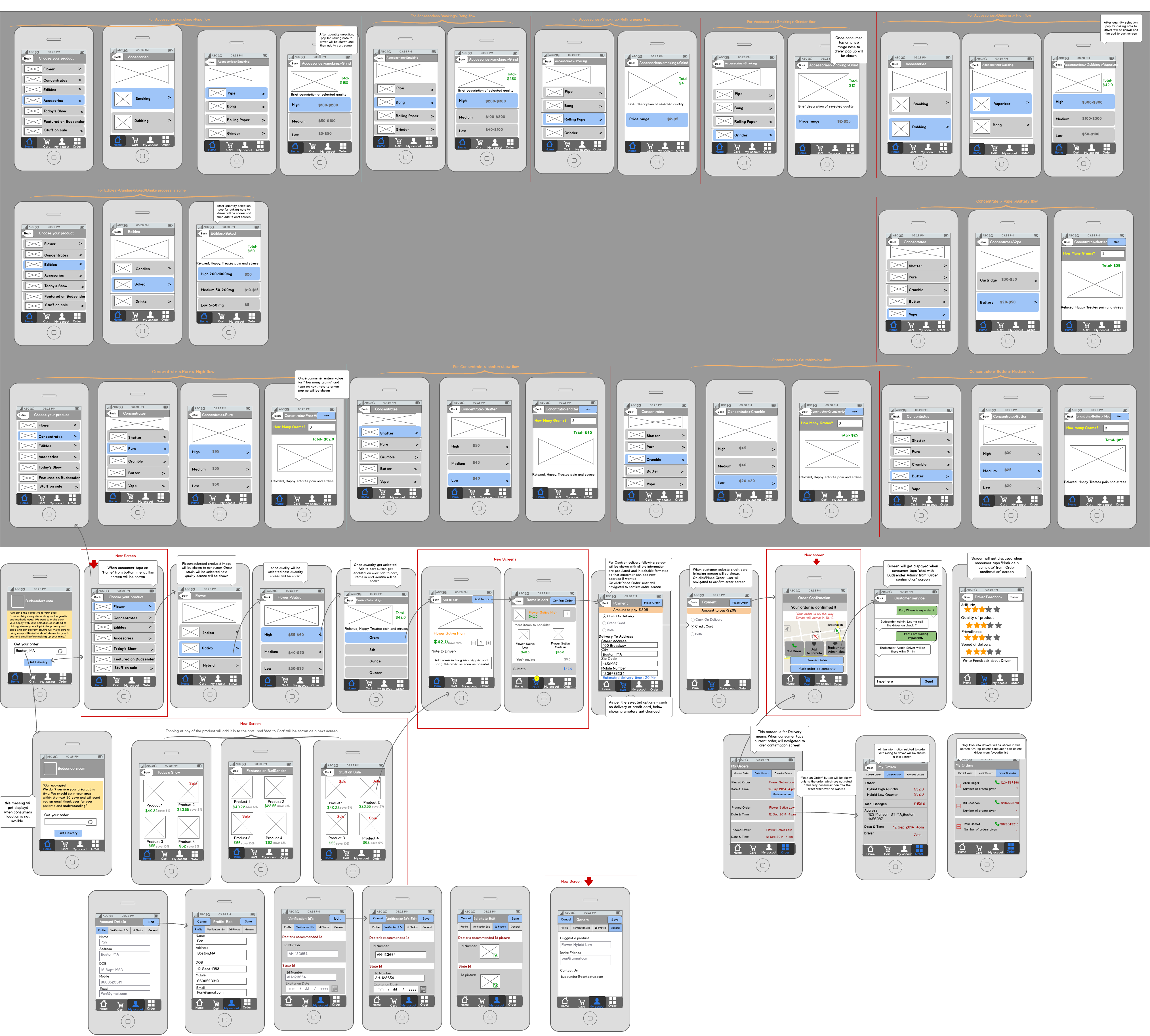
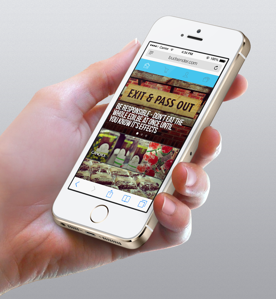
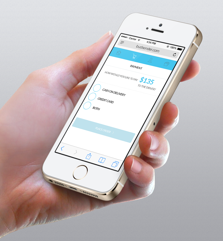
Kushy Punch app needed to be a delivery app for local businesses selling medical marijuana. The complexity of the app is that there are variations in species of the flower, with different potency, there are edibles, vapes, and other products — derivates. The menu needed to be simple and understandable, have a chat app with the driver/delivery service. The app background is huge, but the user shouldn't notice that.
First meeting —
and research.
After meeting with the client, he stated that he needs first an iPhone app, then after the developing team takes over, we will focus on adapting the design to the android platform. Discussing the products he is selling and his ideas of the future products we started to chart an app flow that will be updatable, yet for now having all the categories and subcategories of the line that is in store. The job was huge and after a couple more days we had the rough idea how to proceed.
The client was making a direct interview based research (I was located in Novi Sad, Serbia, the shop is in California, USA) and some based on questionnaires. After getting the results of those I started analysing them and looking at what are the common user needs.
Based on that and the client's and my ideas I proceeded to making the wireframe. I must note here that in the moment of making this app there were only two similar services, and they had only just started — also they were more based on delivering products from multiple shops to the user, not just from one. This made it almost impossible to look at the competition and make a competitive analysis.
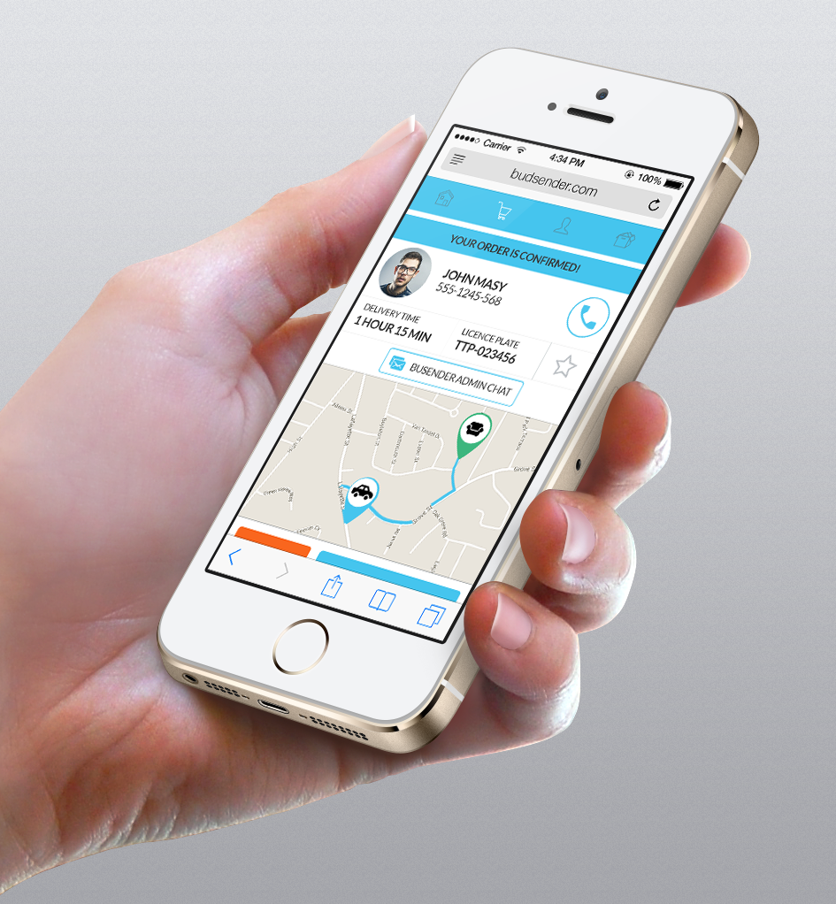
The client changed his mind and decided that the platform for his app will be web-based and that the design needs to adapt to that. This introduced a UX redesign, as websites did not cover the same functionalities as an app (in 2014).
Wireframe
Skipping steps —
the reality of smaller clients.
The client insisted that we skip the low fidelity prototyping part and jump to the high fidelity mockups (lack of funds, timetable) and as we were doing a web app, there would be more data after the launch and the back end coder assured him that all the changes we make would be easily incorporated as the changes would be only on the front end, not the back end. Unfortunately, this is the reality of working with smaller clients and from home. The idea of rapid paper prototyping was for moments on the table, but never conducted.
Cause skipping the prototyping phase, some design ideas from the wireframe didn't transfer the best to the mockups and on the fly, changes were made in the UX. Not so much the flow but some elements of the navigation were moved around to allow more content and to draw more attention to the products, buttons, etc. — basically to elements that on a given page needed more attention.
Conclusion —
a cautionary tale.
This app was made on a tight budget, with shortcuts that the client (stakeholder) requested, against my better judgment, that in the end led to the same timetable — on the mockup phase the errors were noticed and needed rework. The reality of working with clients in 2014 was that they did not believe a lot in personas, prototypes, and user testing, or had no budget resources for those. Doing work like this was a good case to show as a cautionary tale.
After all, fixing a problem in development costs 10 times as much as fixing it in design, and 100 times as much if you're trying to fix the problem in a product that's already been released — a statistic I only came across later, but one that perfectly described what we lived through.
The app never went live. No impact was measured. What remained was a hard lesson in why process exists — and a reminder that the designer knowing the right way doesn't help much when the client holds the budget.