Two hypotheses.
One business, one ours.
The hypotheses that were tested were:
Allowing people to make decisions on the landing page about which plan to buy will yield a 15.6% uplift because users will better understand the value behind that plan.
Putting the focus on value and not on the World Cup will result in a 15.6% uplift, as South African users tend to search for deals.
South African users
behave differently.
From the previous tests, data indicated that South African users behave differently than users in countries based on or heavily influenced by U.S.A/European cultures. This is due to local culture, overall poverty, and the technology used. They tend to focus on deals, try to save data, and do not scroll if it is not necessary.
The majority of site visits are on mobile devices, with a significant number having small 320px wide screens. Desktop devices overwhelmingly have a screen size of 1366x768px. We needed to convey as much information as possible on that screen size without looking and feeling cumbersome.
Ok, before that, some truth time. We also decided to expand on the data given on the website, as the one in use was basic and had some details that were confusing for users based on our research data. Also, it lacked info on the smallest screens, sometimes even the CTA, as previous designs were desktop-first.
1366px desktop view


320px mobile view — hero and full page
What is common —
and what isn't.
The sections dedicated to shows, sports FAQ, USP, and devices to watch on, were the same on all variants.
A and C variant — These variants were focused on the World Cup message in the hero section, while the value was secondary. The difference was that the CTA on variant A led to the signup page and then to plan selection, while variant C's CTA jumped users to plan selection at the end of the page. The secondary CTA on variant A was a regular CTA, while on C, it was the plan selection.
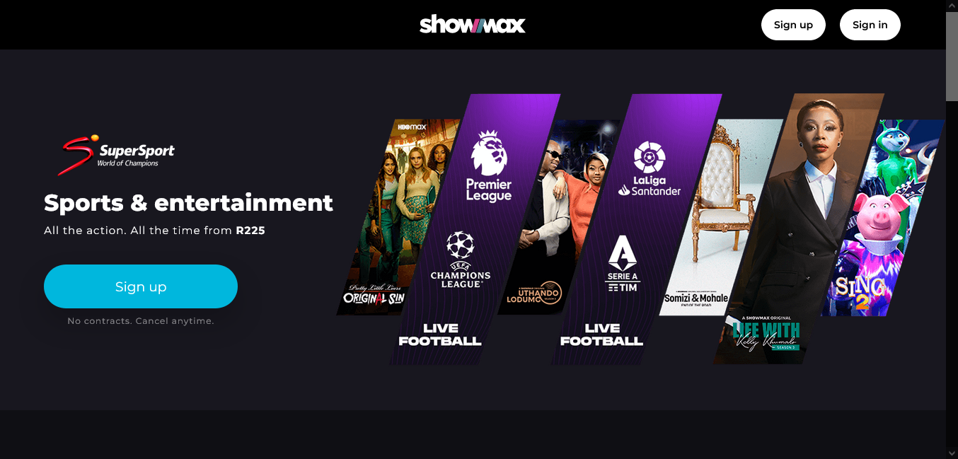
B variant — This variant's hero section focused on value, while the World Cup was one of the USPs. It had a regular secondary CTA button near the end of the page.


"Figures don't lie" —
Foghorn Leghorn
When the results of the tests came in, they showed the following:
The first hypothesis was wrong. All data indicated this before, but now we can show that forcing users to scroll won't help. Also, plan selection on mobile is not working in the state as it is. It was a desktop-first design and modified for mobile. Businesses insisting on showing the more expensive plan first while on CTA stated from a lower starting price didn't help this case either. The numbers showed 5% less engagement, less signups and in the end, subscription bought.
The second hypothesis was correct. It showed 21% more engagement, 3% up in AOV, and 25% up in RPU.
Hypothesis 01 — Engagement on variants A & C. Forcing users to scroll and showing desktop-first plan selection on mobile didn't work.
Hypothesis 02 — More engagement on variant B. Focus on value over World Cup messaging worked for South African users.
AOV uplift on variant B.
RPU uplift on variant B.
The conclusion was to use the B variant as a base for future improvements. To focus more on value deals and USP shown to users in further variations.