A new studio. No gravitas. An "easy" task.
The Daily Missions feature was the first major task for the new Prague studio inside Wargaming. Minsk HQ handed it over as a simple, no-changes-needed implementation. Their misfortune — and ours — was that it was seen first by the Prague design team before it went to production.
The solution envisioned by the other team had problems. UX problems, tech problems, and the kind of problems that come from designing without measurements in a technology stack that requires them.
We were a new studio with no track record inside the company. Every problem we identified required data to back it up. Opinion wasn't enough. Neither was common sense. Everything needed proof before anyone would listen.
Three problems. Each one a fight.
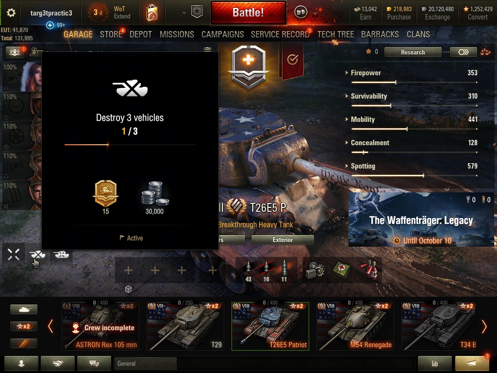
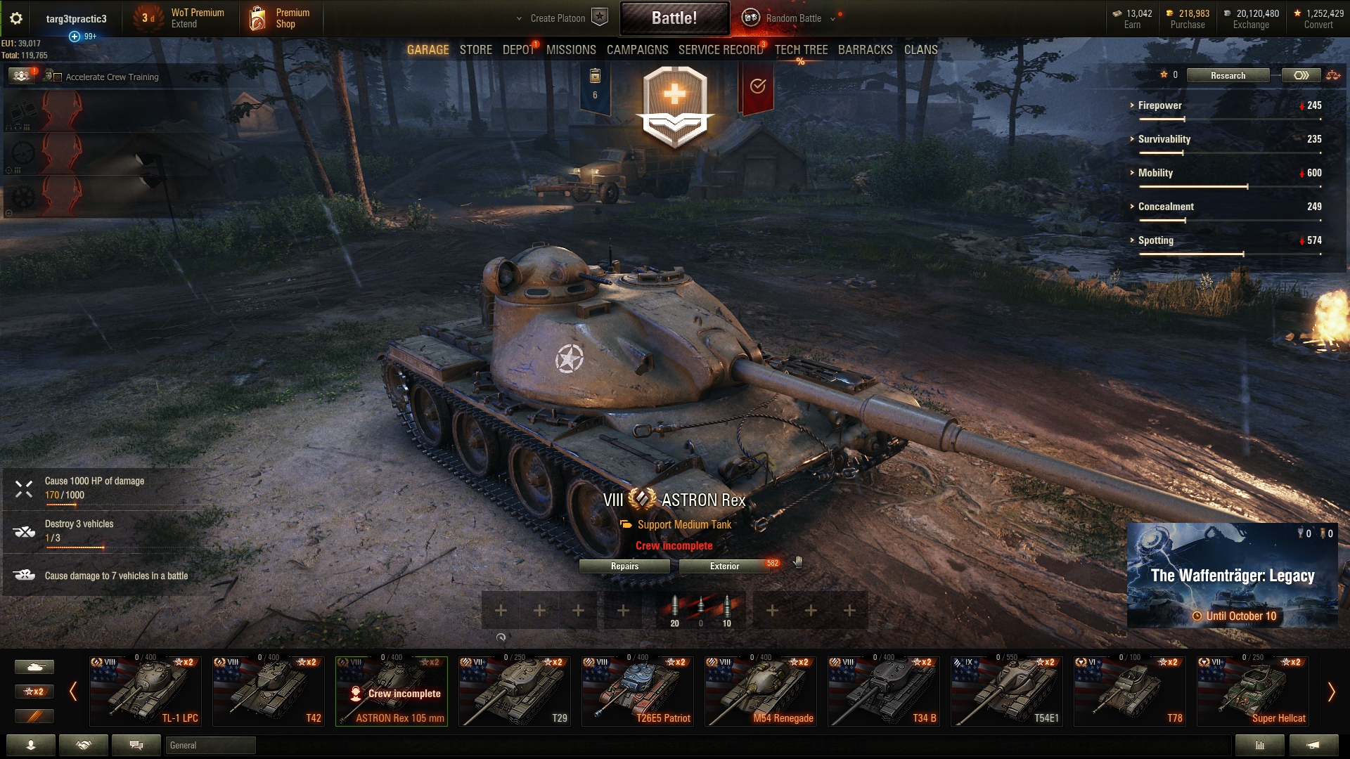
Each of these required data. Not opinions — data. Research tests, comparative analysis, usage numbers. The work of justifying obvious UX decisions to people who'd already decided.
Internal staff. Small study, clear signal.
I ran the user research myself, on internal staff. A small study — but the signal was clear. Cards in the old design were being overlooked. The new design reduced missed notifications to a negligible percentage.
I also gathered all possible combinations of mission text lengths, languages, and screen sizes — to prove that the new card design handled every edge case where the old one failed.
Because we were a new studio with no internal credibility. "It's bad UX" wasn't a valid argument. Numbers were. Every decision needed to be bulletproof before it went into a review with Minsk.
Not a web app — in-game UI rendered via Gameface.
Worth clarifying before getting into the solution: World of Tanks UI was fully in-game, rendered via Gameface (Coherent Labs) — HTML, CSS, and React running inside the game client. This was part of a larger Flash/Scaleform to React/Gameface migration.
That meant design constraints that don't exist in a standard web context: exact pixel measurements, no browser dev tools, tech limitations that killed several otherwise good solutions. Constant back-and-forth with developers about what the technology could actually do.
The re-roll fix — one more step, one fewer headache.
The original re-roll: the user had to tap an unmarked part of the card — no visual cue, no indication the area was interactive. The card would then flip to reveal the re-roll option. No warning that this was limited to once every 4 hours. No confirmation dialog. The action just fired. Accidental tap, re-roll gone, blocked for 4 hours.
Our solution: a visible re-roll button using the standard reload symbol, with text on hover. A confirmation popup before the action — informing the player this was only available once every 4 hours, so they could decide before it was too late. One extra step in the flow. Zero guessing.
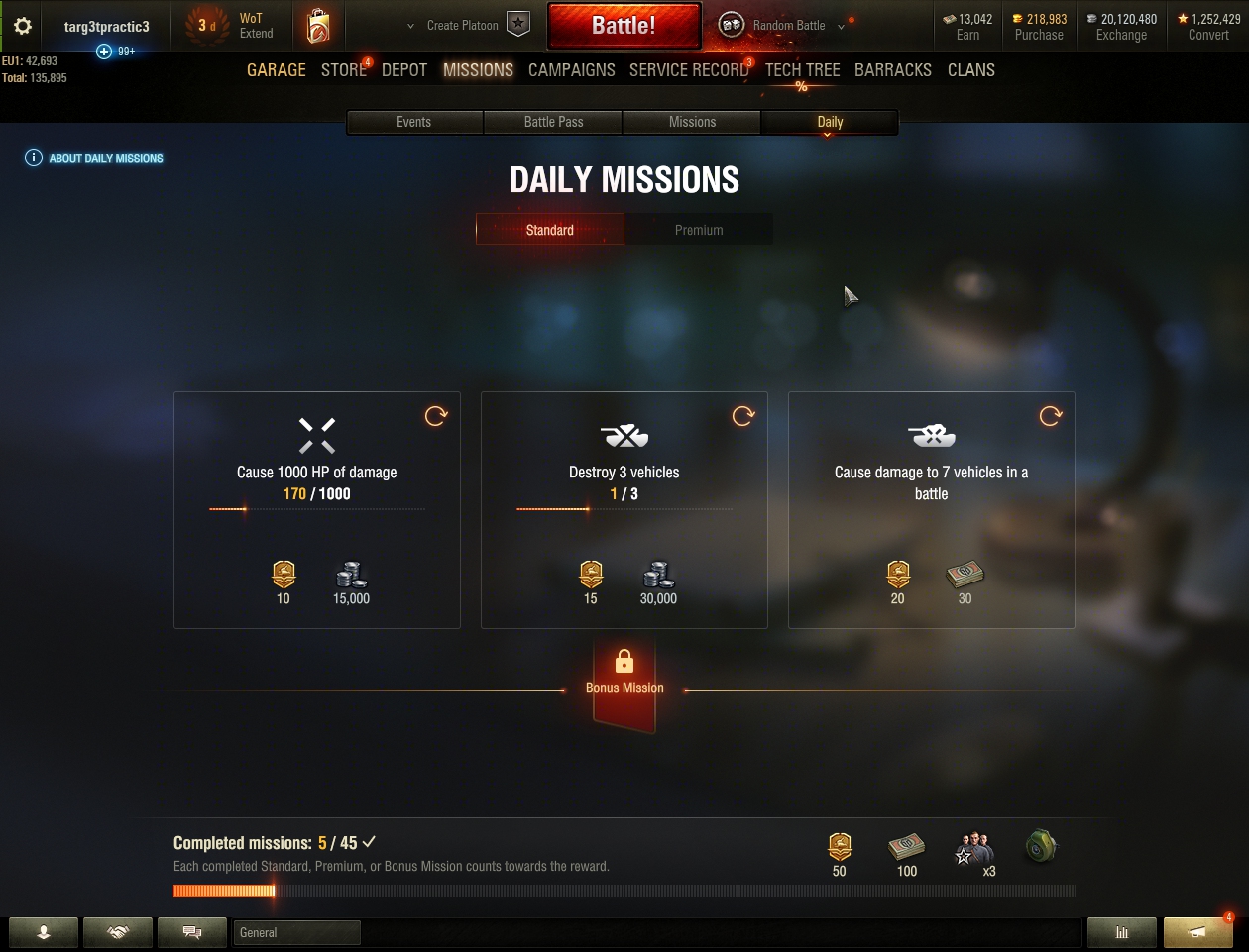
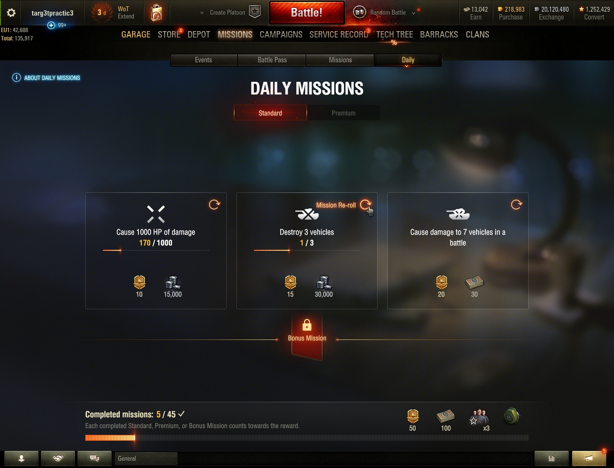
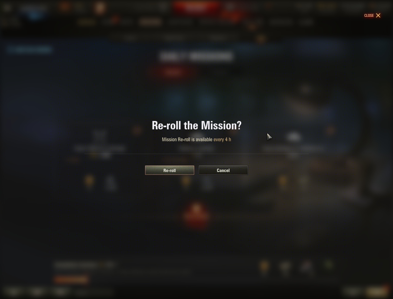
Because absolute visual minimalism isn't the goal — simplicity for the user is. One more step in the flow, one fewer guess. And one fewer forum post dragging the feature through the mud — which is where we measured satisfaction anyway.
That was the proposal. The button didn't exist in the design system — no such element had ever been built — so it needed sign-off from Minsk. We had the research, the edge cases, the comparative analysis of how other games handled it. We thought that would be enough.
Airtight. And rejected anyway.
It wasn't part of the design system. That was the answer. Not "your data is wrong" — the data was never really argued with. It just didn't count for much. A new studio with no gravitas doesn't win on evidence alone, and we didn't.
We were told to stop pushing. Months of research, every edge case documented, comparative analysis of how the rest of the industry solved exactly this — and the feature would ship as handed down. That was supposed to be the end of it.
Not being wrong. Being right without power. Every number we had was solid. None of it mattered, because nobody who could say yes needed it to matter.
A visitor from Minsk — and one honest answer.
Someone from Minsk was walking through the studio. He stopped, looked at what was on my screen, and asked what he was looking at. I had no idea who he was. To me he was just some guy visiting from HQ.
So I told him the truth. That this had been handed to us as finished. That we'd found it was broken. That we'd done the research, built the fix — and been told to keep quiet about it. Then I showed him the solution.
He said: "I want this. This is what we need."
That settled it. One conversation did what months of evidence hadn't. He was an executive — I only found that out afterwards.
Nothing I did differently. It was the same work it had been for months — same research, same prototype, same argument. The only variable was who happened to be standing in front of it, and whether that person had the authority to say yes.
Win. What a price.
The fix shipped. A visible re-roll button using the standard reload symbol, text on hover, and a confirmation dialog explaining the four-hour limit before the action fired. No guessing, no hidden interactions, no accidental actions.
New element in the design system. The button that had been rejected for not existing in the system became part of the system. It hadn't been there before we pushed for it.
Testing moved before launch. Previously testing happened after design and development were finished, weeks from release, when it was too late to change anything meaningful. This project changed that.
The outcome, yes — players got a feature that didn't punish them for a mistap, and the studio ended up with two things it didn't have before. The process, less so. I don't get to tell this as a story about persistence paying off. It didn't pay off. It paid off because a stranger asked a question.
Being right with data isn't enough when you have no power. That's the real lesson, and it's more useful than the version where I push hard and eventually win. Evidence needs someone with authority to care about it. Part of the job — the part nobody teaches — is finding that person. Or getting lucky enough that they walk past your desk.