You are all crooks — what users were saying.
Showmax offered a payment method called vouchers where users would enter a code that they could get in various ways and either upgrade or downgrade their subscription for a set amount of time. This was set up by engineers before Product Design was part of the firm, and it had some logic — but an IT one, not a user friendly one.
This was what we got from a lot of user reviews who used vouchers. They mentioned stolen money, days, and double payments — not because money was actually taken, but because without any information about what a voucher does, it felt exactly like that. In the case of one promotion, there were thousands of complaints to the customer service and reverts. As vouchers were one of the major promotional tools before The World Cup in Qatar, further investigation was needed.
As users entered the code, action was taken without confirmation from a user — and even the end information was vague at best. As these codes weren't tied to specific users, it could happen that the user who entered the code wasn't the one who got it, or that they knew anything about what it does.
The rabbit hole was deep and dark.
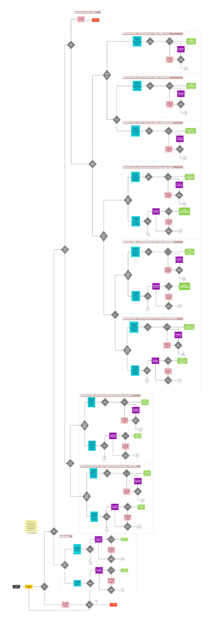
With the help of the PM and a dedicated QA engineer, we started to map out the possible ways users can interact with vouchers depending on their subscription status. What we found was a system of interconnected edge cases that nobody had ever fully documented.
There were multiple voucher types — and each one behaved differently:
Both are unique codes, same in every way except Voman were partner-only codes (payment, telecom, etc.).
All the same code — named after the first campaign inside pizza boxes. Tied to specific campaign periods and dates.
Users needed to leave credit card information to use it. Requires a recurring payment to be set up.
Bundles — like buy one get one free. The user pays first, then the coupon is stored to be used for the next payment.
All these interacted differently depending on whether users had a subscription or not, whether it was an upgrade (as defined by us) or not, and which plan they were on. The end result: some vouchers caused users to pay for the same subscription day(s) after they purchased the previous one. Some stored days in odd places as credit days. In all cases the biggest problem was users didn't know anything about it.
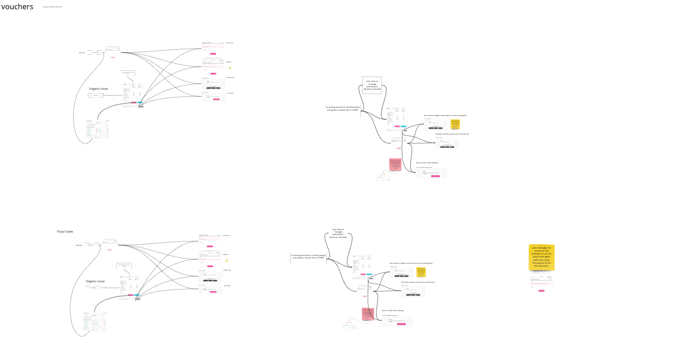
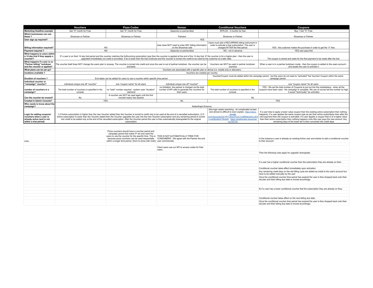
Engineering doing UX — the "later date" problem.
In some cases when a voucher code was entered, the days the user had as a subscription were stored "to be used at a later date" — which were not defined in any document. If it needed to be activated manually, it was hidden under menus and submenus in the user/admin settings.
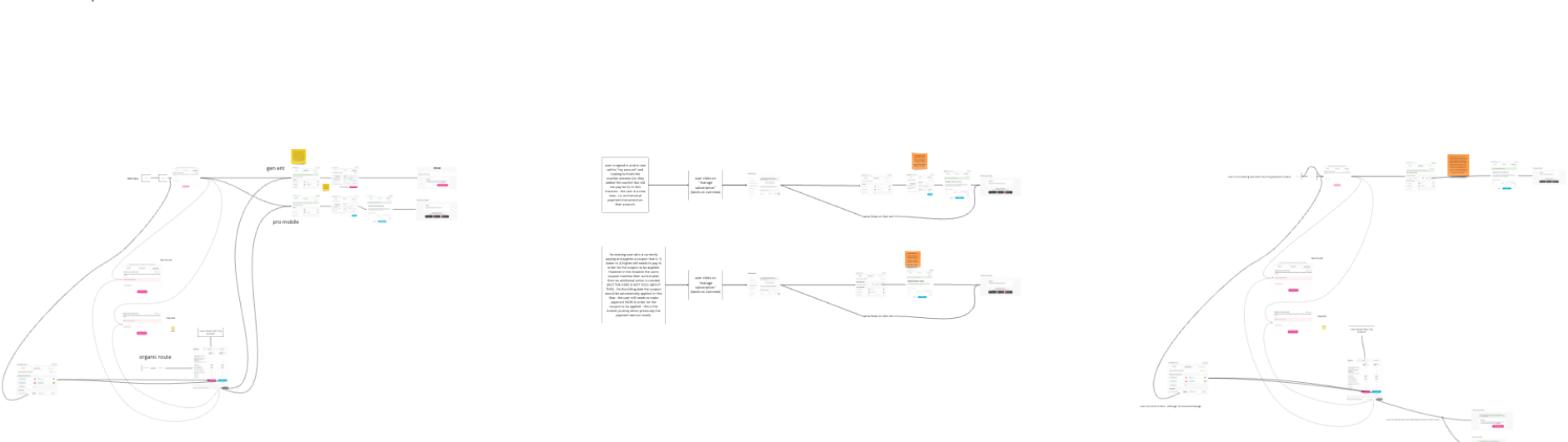
With the help of a system designer and a QA engineer, we started to simulate all the journeys and to define where this "later date" actually is, whether it's an automatic process or manual input is needed. A couple of weeks of work later we had the details — but also the realisation that this product is so embedded in the core of the payment section that fixing it properly would need a year at least and a lot of resources.
Time and money we didn't have. And as vouchers were only 3% of all payments, we decided to save what could be saved.
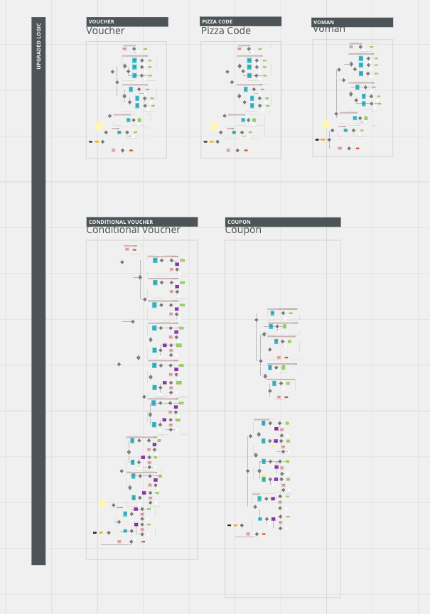
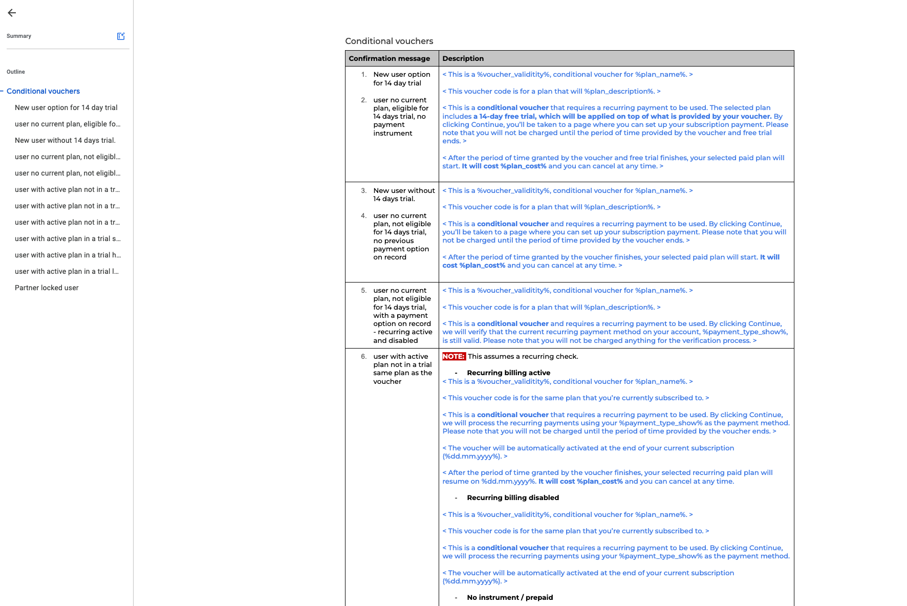
70 messages. Not a typo.
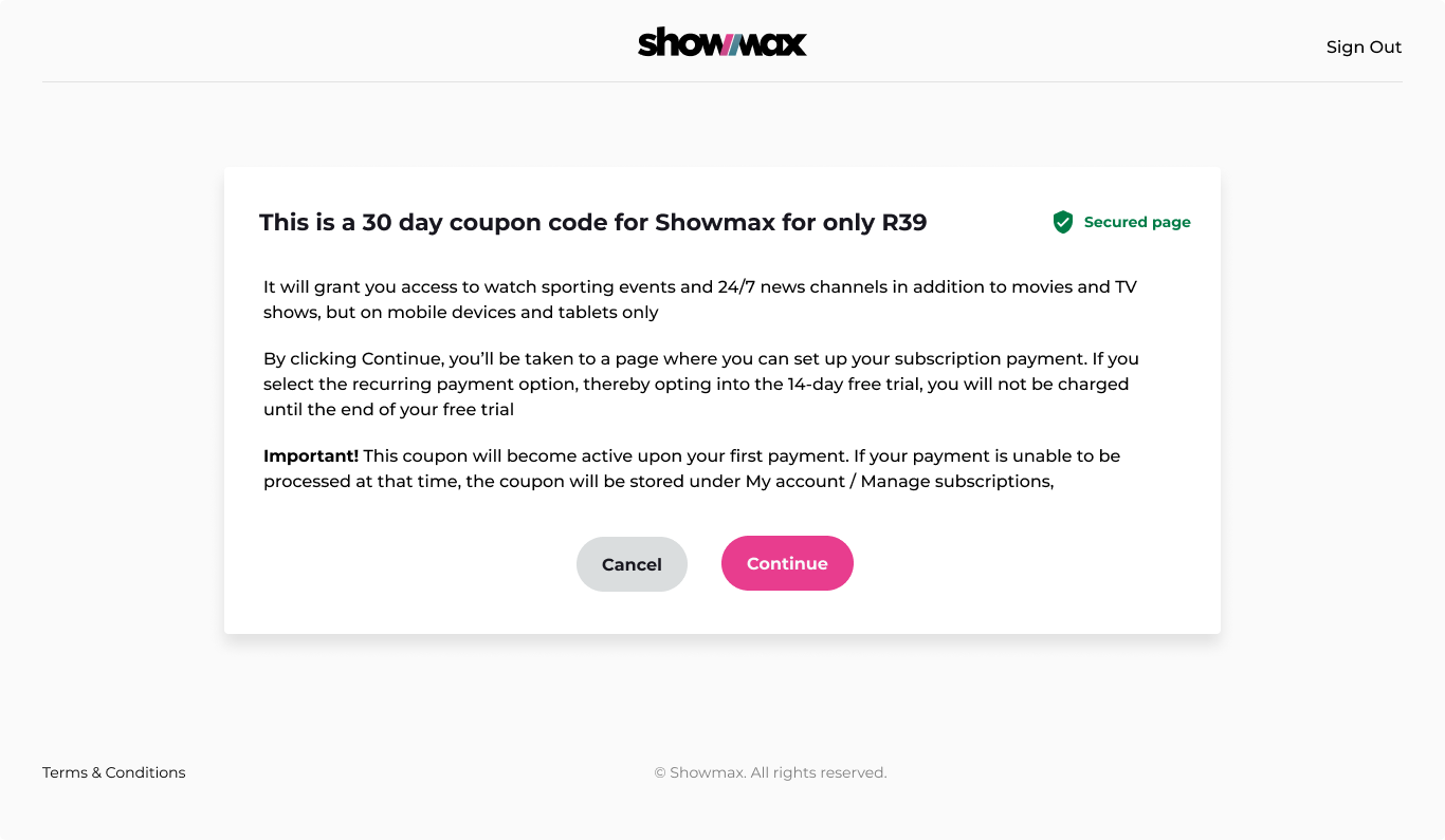
The decision: implement a page that informed users about the changes before they happened. Users would be informed about the type of code, which subscription it contains, the time period of the upgrade/downgrade, and what will happen if they already have a subscription. The page offered them a chance to decline — which was not possible before.
Mapping out all the journeys and where to insert the page resulted in around 70 different possible messages. The messages were set up so that parts of them are interchangeable, to reduce coding time and complexity. Information hierarchy was key — the further down, the less important.
A UX copywriter went through the text to make it more human and grammatically correct.
No A/B test. There was nothing to compare.
There was no time or need for A/B testing — this update wasn't comparable to the previous journey, even though it was only one page inserted. We ran a test on a small campaign gathering user input: data points on the webpage, surveys, monitoring customer support.
The text seemed too long, so there was another round of adaptation before it was used on the World Cup promotion. In the end, what was measurable was a huge reduction in complaints to customer support and in reviews.
Significant reduction in customer support complaints following launch — from thousands per campaign to manageable volume.
Negative reviews citing stolen money and double payments dropped sharply after the confirmation page went live.
70 messages later — I am a different man.
What would I do differently?
Honestly? Not much I could have. The voucher system existed long before I joined. The engineering debt was baked in. What I could have pushed harder for was getting UX involved in the scoping conversation earlier — before the World Cup deadline made everything a fire drill. But that's a company culture problem, not a design one.
What did this teach me?
That inherited systems are their own discipline. You can't design your way out of a fundamentally broken architecture — you can only contain the damage and make sure users understand what's happening. Also: 70 messages is too many messages. Never again without a copywriter from day one. And 70 messages means 70 combinations you need to have in your head at once. Every stakeholder question, every PM query, every designer asking "but what if the user has X" — you need to know the answer immediately. It's not design work at that point, it's memory management.
Any surprises?
That nobody had ever written down what "later date" meant. It was in nobody's documentation, nobody's spec. It existed only in the heads of engineers who'd moved on. A core part of a payment flow — completely undocumented.
Going forward?
If a payment flow was built without UX, assume it's broken until proven otherwise. And map the journeys before the complaints arrive, not after.